The Poor Mans Art Collection
Art is subjective. What some consider masterpieces, others may see as worthless. Beauty truly lies in the eyes of the beholder, and music follows the same path. Some people revere The Beatles as musical geniuses, while others find their music awful.
Art and music often intersect in fascinating ways, particularly in the realm of album and single covers. Over the years, there have been countless iconic, provocative, and brilliant album covers that stand as works of art in their own right. These covers span all genres, each with its own unique meaning and nuances that deepen the listener's connection to the music.
The album artwork often serves as the first glimpse many have of a record. Whether it’s picking up Sgt. Pepper’s for the first time and diving into its psychedelic masterpiece or gazing at the light spectrum on The Dark Side of the Moon and recalling those school physics lessons, these album covers are pieces of art for the everyday person. Not everyone has the Mona Lisa in their home, but the vast majority of us have access to these albums. Whether through owning a physical copy or streaming them on the devices in our pockets.
Album artwork is a vital art form that, in my opinion, adds an extra layer to the most important art form music. In this article, I want to take you through some of my favorite pieces of album art, featuring both classic works and some more obscure records along the way.
1. Pink Floyd- Wish You Were Here
Pink Floyd could have countless entries into this list, their artwork is just as iconic as their musical output. From the light prism of 'Dark Side of the Moon' to the pig flying above Battersea Power Station for 'Animals' and even 'The Wall' and it's simplistic white bricks and red text.
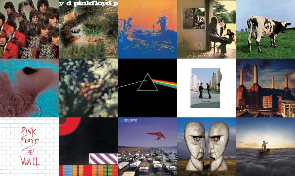
'Wish You Were Here' has always captivated me, particularly its iconic album cover: two men shaking hands, with one of them engulfed in flames. It stands as one of the most provocative pieces of art ever created.
The album's cover imagery was conceived by Aubrey "Po" Powell, the partner of Storm Thorgerson at the design studio Hipgnosis. Inspired by the idea that people often hide their true emotions out of fear of "getting burned," the artwork depicts two businessmen shaking hands, one of them literally on fire. The phrase "getting burned" also held particular resonance in the music industry, often used by artists who had been cheated out of royalty payments.

The photo was captured at Warner Bros. Studios in California, using two stuntmen—Ronnie Rondell and Danny Rogers. One wore a fireproof suit beneath a business suit, with his head protected by a hood hidden under a wig.
The album's themes, especially in songs like 'Welcome to the Machine" and "Have a Cigar,' are mirrored in this striking artwork. The image of the two businessmen sealing a deal serves as a broader critique of the music industry and its inherent dynamics of exploitation and change.
Even today it is still one of the most widely recognisable images in music.
2. The Beatles- Abbey Road
Like Pink Floyd, I could have chosen a number of albums by The Beatles. 'Abbey Road' is probably alongside 'Sgt Peppers Lonely Hearts Club Band' the bands most famous album art work.
Picturing all four members of the band, walking across the zebra crossing outside Abbey Road studios in London. The image was shot on August 8th 1969 using an idea originally planned by Paul McCartney.
On the day of photography. Linda McCartney took a few shots, and then traffic was stopped by one policeman and the photographs were taken. The Beatles walked across three times, and that was that.

It is more than an iconic photograph though. This was a key part in the bands history. 'Abbey Road' was the last album recorded by The Beatles and this photo was taken a mere 12 days before the bands last ever studio session together on the 20th August 1969. The photograph also shows The Beatles walking away from Abbey Road, the studio is on the left of the image, Lennon leads the group away, significant because he was the first to permanently leave The Beatles.
The photograph is also the source of conspiracy theories. In late 1969 some fans believed that Paul McCartney had died in a car accident in 1966 and had been replaced by a look a like. Fans commented saying that Paul was out of step with band mates, and that him walking barefoot was a sign. There are other clues too (apparently)
The white Volkswagen Beetles that bears a number plate saying “28IF” - Paul would have been 28 IF he’d had survived (he’d actually just turned 27); the police van on the cover is usually seen at traffic fatalities; and the four Beatles represent a funeral procession: George is the gravedigger, Paul is the corpse, Ringo is the congregation and John is the priest.
Quite the theory, and quite the cover art.
3. New Order- Blue Monday/Power Corruption & Lies
I'm combining these two because I feel that they are both iconic and they also relate a little to each other.
'Blue Monday' was released in March 1983 and was the fifth single by New Order. It also firmly saw them leave their Joy Division past behind. Instead drawing on more disco, and synth based sounds. The singles artwork and packaging, is almost as iconic as the song.
Designed to resemble a floppy disk, it does not contain any details about the group, or song in plain English anywhere on the single sleeve. Instead the band and designer Peter Saville opted to use a colour coded legend, to spell out "FAC 73 BLUE MONDAY AND THE BEACH NEW ORDER"
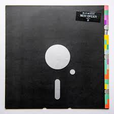
The key enabling this to be deciphered was printed on the back sleeve of the album, 'Power, Corruption & Lies'.
The singles sleeve was so complex due to the intricate design, colour coding and the need for die cuts to be made. Many have commented, that every time New Order sold a copy of 'Blue Monday' they actually lost money. However this is often reputed as no one is quite sure if it is true or not.
'Power Corruption & Lies' also has a rather interesting story. The albums sleeve features a photograph of a famous painting by French artist Ignace-Henri-Théodore Fantin-Latour. "A Basket Of Roses" painted in 1890.
Peter Saville had seen the painting in the National Gallery in London and wanted to use the image, however was unable to obtain permission. Tony Wilson the head of Factory Records stepped in and called the gallery. Peter Saville said in a 2011 interview, "In the course of the conversation, he said, ‘Sir, whose painting is it?’ To which the answer was, ‘It belongs to the people of Britain.’ Tony’s response was, ‘I believe the people want it.’ And the director said, ‘If you put it like that, Mr Wilson, I’m sure we can make an exception in this case’."
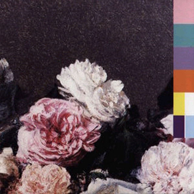
Just like 'Blue Monday' the cover has coloured blocks, and the back of the album shows a colour wheel allowing the listener to decode the message.
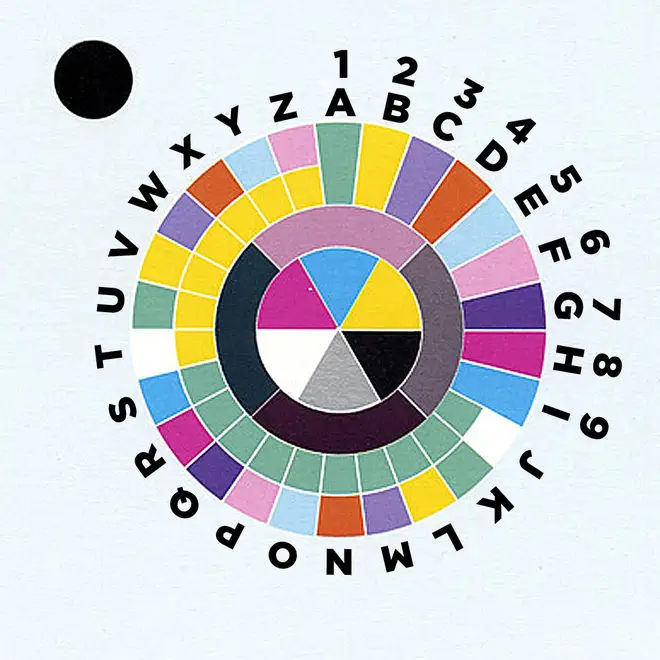
Both of these are iconic pieces of artwork, and were the perfect symbolisation of Peter Saville's creative genius at work. Giving New Order fans a challenge to decode the message. These two records are now just as well known for their art work as they are for their music.
4. Joy Division- Unknown Pleasures
Whilst we are on about Factory Records.
'Unknown Pleasures' is one of the most recognisable album covers of all time, the unpredictable angles against a dark background. What is it? A mountain range, a graphic representation of brain waves? The image is actually is a graphical representation of a pulsar, officially named CP1919. Designer Peter Saville reversed the colour scheme to make it white on black.
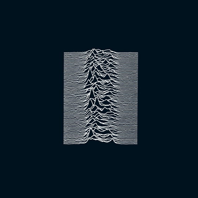
The image has become one of the most iconic music images of all time, even long after Joy Division was over. Outside of the Joy Division fan base, the image has been used on clothing, other albums, tattoos. It has transcended the band, and the album. It's one of the most iconic album covers ever. Rolling Stone magazine ranked it as the greatest album cover ever. It would be hard to disagree.
5. Fleetwood Mac- Rumours
Fleetwood Mac's 'Rumours' is one of the most iconic albums of all time. The whole story od the record, how it was recorded and the songs that feature on it. Have cemented the album as one of the best albums of the 1970s and arguably Fleetwood Mac's best work.
The cover is made up of only two members of the band are featured on the albums cover. Stevie Nicks (caught mid swirl with a shawl flowing behind her) and Mick Fleetwood (with a pair of toilet-chain balls dangling between his legs) the pair of them holding hands.
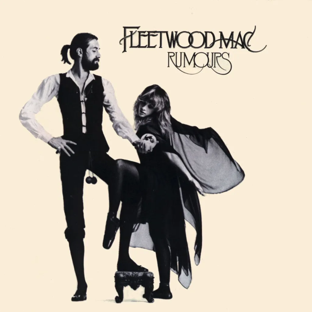
During the recording of 'Rumours' the band were falling apart, their personal relationships had begun to deteriorate. he two couples of the group, John and Christine McVie as well as Stevie Nicks and Lindsey Buckingham, were both crumbling before their very eyes while Mick Fleetwood was also going through a divorce. Which adds a little to the confusing cover, why are Fleetwood and Nicks on it. What does it all mean, it just adds to the mystery and mystique of the band. Fans were drawn to it, and the album would sell in it's millions.
Gripped by the artwork and the situation that the band found themselves in, people really wanted to hear this record.
6. Oasis- Definitely Maybe
I've made no secret of my love for Oasis. This is my favourite record of theirs, and in my opinion their best album cover. It features all five of the original line up, the photograph was taken in Manchester, in guitar player Bonehead's living room and features some very interesting references.
Originally the idea was that the band would be shot around the dining table of Bonehead's house. There had been a photograph taken of The Beatles in Japan with all of the band members sitting around a coffee table. Noel wanted to do something similar. However the bands photographer could Michael Spencer Jones could not see the idea working.
The photo idea was changed and moved to the living room. Liam is actually lay on the floor due to issues with the photographers lens, rather than some profound statement.
Each band member then added some personal belongings to the photo. The pink flamingo was Bonehead’s. Liam, Noel and Guigsy were City fans, so we put a photo of Rodney Marsh in the fireplace. Bonehead, being a United fan, wanted the George Best picture that’s at the window. The film on the tv is Noel's favourite 'The Good The Bad & The Ugly', the wine next to Liam is actually Ribena.
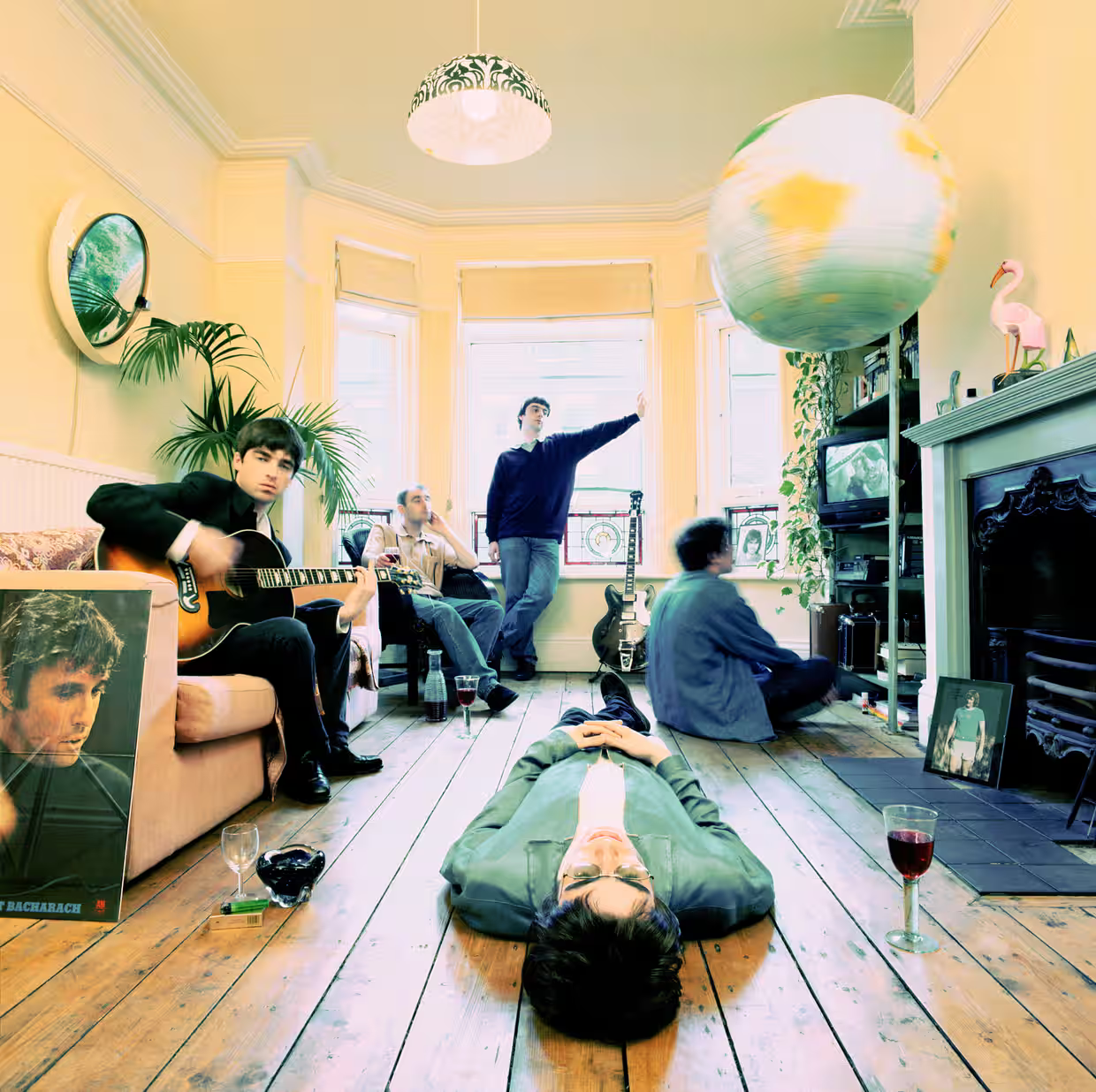
There's a photo of Burt Bacharach propped up next to the sofa, Noel has commented on Bacharach's influence countless times throughout his career.
It's one of the greatest photo's taken of Oasis, and is a perfect advert for them as individuals but also the album.
7. Peter Gabriel- Melt
Peter Gabriel's third solo album is a dark affair, and it's cover perfectly encapsulates this dark feeling and mood. With half of Gabriel's face melting away. To take this iconic image Gabriel turned to Hipgnosis, whose founders, Storm Thorgerson and Aubrey Powell, had become legends for their work with super groups, such as Led Zeppelin and Pink Floyd. Allegedly, the idea of depicting Gabriel with a melted face arose from a dream that Thorgerson had about a dripping face. Mick Jagger or Bryan Ferry would have scoffed at the idea. But Gabriel was inspired; after all, Gabriel had willingly manipulated his own appearance on the covers of his first two albums.
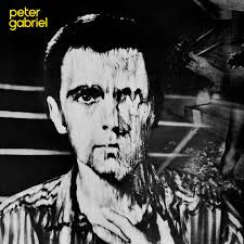
This album now known as 'Melt' was a huge success for Gabriel becoming his first gold album, and featuring two hit singles 'Games Without Frontiers' and 'Biko'. It saw Gabriel embrace art rock, post punk and new wave sounds. Creating a haunting LP that touches on political assassinations (“Family Snapshot”), the futility of war (“Games Without Frontiers”), and the brutal murder of South African activist Steve Biko (“Biko”).
For many this is Gabriel's best to work.
8. Blondie- Parallel Lines
'Parallel Lines' is Blondie's best and most iconic album. However at the time, the artwork caused a disagreement within the band.
The photograph taken by Edo Bertoglio, features the band in matching suits, all with the exception of frontwoman Debbie Harry who is stood front and centre wearing a white dress. Initially the band rejected the photograph. However their manager Peter Leeds chose it to be used and well, he won. The album artwork is not only iconic, it is backed up by some of the best songs the band ever recorded.
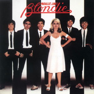
The album shot to Number One in the UK and was their commercial breakthrough in the US where it peaked at #6. It finished 1979 in the #9 position in the top pop album year end chart and has sold over 20-million copies worldwide.
It featured the singles 'One Way or Another' and 'Hanging on the Telephone' and for many is Blondie's best work. The iconic cover being the first impression many get of Blondie.
9. Queen- A Night at the Opera
Queen's 1975 album 'A Night at the Opera' is the fourth studio album by the band, and it's one of their most successful producing the bands first Number One Single in the UK 'Bohemian Rhapsody' and. selling over six million copies.
It's artwork shows a colourful rendition of the bands logo originally designed by Freddie Mercury. The Queen crest is mad up of the Zodiac signs of each band member. two lions for Leo (John Deacon and Roger Taylor), a crab for Cancer (Brian May), and two fairies for Virgo (Freddie Mercury) – placed around a letter Q. With a phoenix also included representing immortality.
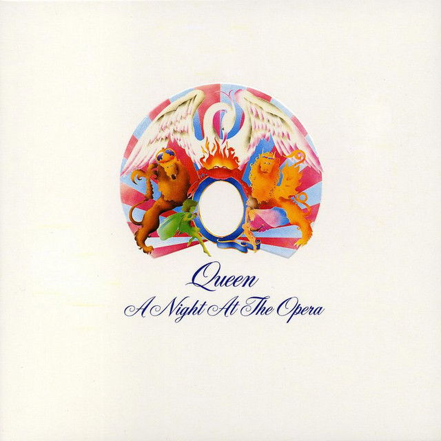
At the time the album was recorded it was the reportedly the most expensive album ever recorded with the estimated cost being £40,000 (equivalent to £423,800 in 2025). The band used 7 studios to record it and it saw the band embrace numerous different styles such as ballads, music hall, sea shanties, hard rock and progressive rock.
This was the moment where Queen really elevated things and would go on to cement themselves as one of Britain's most important bands.
10. Blossoms- Gary
A fairly new album in the context of this list. Released in 2024, 'Gary' is Blossom's first album as an independent band. Recorded and released under the bands own record label SK2 records. With it's title and lead single 'Gary' being named after an 8ft fiberglass gorilla. It is classic Blossoms.
For the cover art, the band took a rather simple approach. They wanted to spell out the title. How they did that was use their bodies. All five members dressed in black, against a orange background manoeuvred their bodies to make the word 'Gary'
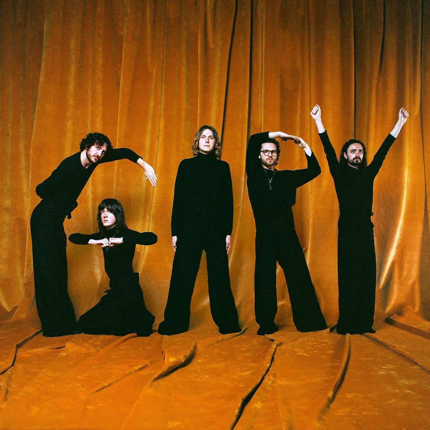
It's a very good album as well, with the classic Blossoms elements littered throughout. Jangly guitars, infectious drum beats, 80s synths and huge choruses. This record is not only one of the bands best, but one of the best albums of recent memory.
11. The Stone Roses- The Stone Roses
Similar to Oasis, I have been quite loud with my love and praise for The Stone Roses, and with good reason. This debut album is quite simply one of the best albums ever. The albums cover art is nearly as iconic as the songs.
Designed by the bands guitarist John Squire with clear influence from American abstract painter Jackson Pollock. With influences from a whole host of places. The patterned background is said to have been inspired by the Giant's Causeway in Northern Ireland. The group had visited the famous rock formation shortly before the release of the debut album; they had travelled across the Irish sea to play a gig at the University of Ulster in Coleraine.
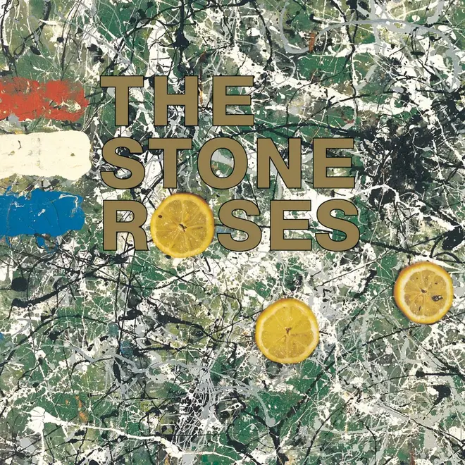
Meanwhile the lemons are said to have been inspired by a visit to Paris. In an interview with Q magazine published in 2001, Squire discussed the motivation behind his artwork: “Ian [Brown] had met this French man when he was hitching around Europe; this bloke had been in the riots, and he told Ian how lemons had been used as an antidote to tear gas. The French flag can also be seen, at the top left hand corner of the artwork.
This record is still one of the most important records ever recorded and released by a British band, a statement piece of music, and art. That ushered in a new decade, a new scene and gave working class people in Britain a voice.
12. Sex Pistols- Nevermind the Bollocks
Everything about this album was controversial. It was an album that inspired those that were living the reality that the band were talking about, it was a social commentary of the lives they were living but also the lives of millions of others in England. The first and the definitive punk album. The sound, the content, the cover, it is what we think of when we think punk.
The album cover designed by Jamie Reid, who had worked with the Sex Pistols before, aimed to be provocative and cause controversy. With it's yellow and pink design it was a bold statement piece. Which the establishment did not like.
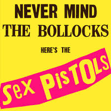
Remarkably, London police visited every single Virgin record store branch in the capital and told them that if they didn’t remove the album cover posters in their windows, they would prosecute them under the 1899 Indecent Advertisements Act. Then on 9th November in 1977, shortly after the release, the London Evening Standard announced the arrest of a Virgin Records shop manager in Nottingham for displaying the record after being warned to cover up the word ‘bollocks’.
The Sex Pistols changed music forever in Britain, they rocked the old order. Britain's establishment had never seen a band like it before. They opened the doors for the generations after them. This record still stands up today. It's artwork is iconic, the songs are still relevant, maybe even more relevant and pertinent than they were in 1977.
13. Tame Impala- Currents
'Currents' is one of the most iconic and important indie pop albums of the 2010's. Fans and critics proclaimed the album as a classic. A psychedelic pop masterpiece.
The albums artwork a silver ball ripping through waves of psychedelic sludge, has become synonymous with Kevin Parker and indie music fans all over the world.
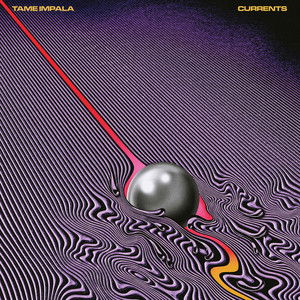
The albums artwork was designed by Robert Beatty, and was intentionally designed, this was not some psychedelic accident. Parker asked Beatty to create the cover based on the concept of vortex shedding, which in fluid dynamics, happens when an object disturbs a surface – like the ripples raindrops leave in puddles. Parker had been collecting reference images, all of which Beatty noticed looked like optical art, with distinctive patterns and tight parallel lines that were so close together, it almost looked like they were vibrating.
He took this brief and created the design we see on 'Currents' it perfectly matches the sound and feel of the album. Probably more than any of the other covers on this list. This cover looks how the album sounds. An artistic and musical collaboration that works perfectly in tandem.
14. Wolf Alice- Blue Weekend
This is one of my favourite albums ever, the sound of a band operating at their very peak. Critics and fans agreed with me. Commenting on this record stating it was the bands best work to date. It's a collection of brilliant songs with a widescreen polished sound.
The albums cover, and music videos were all directed by Jordan Hemingway and they add the extra dimension to the record. Adding context and nuance to each song. Portraying the band as characters in their own 'Blue Weekend'
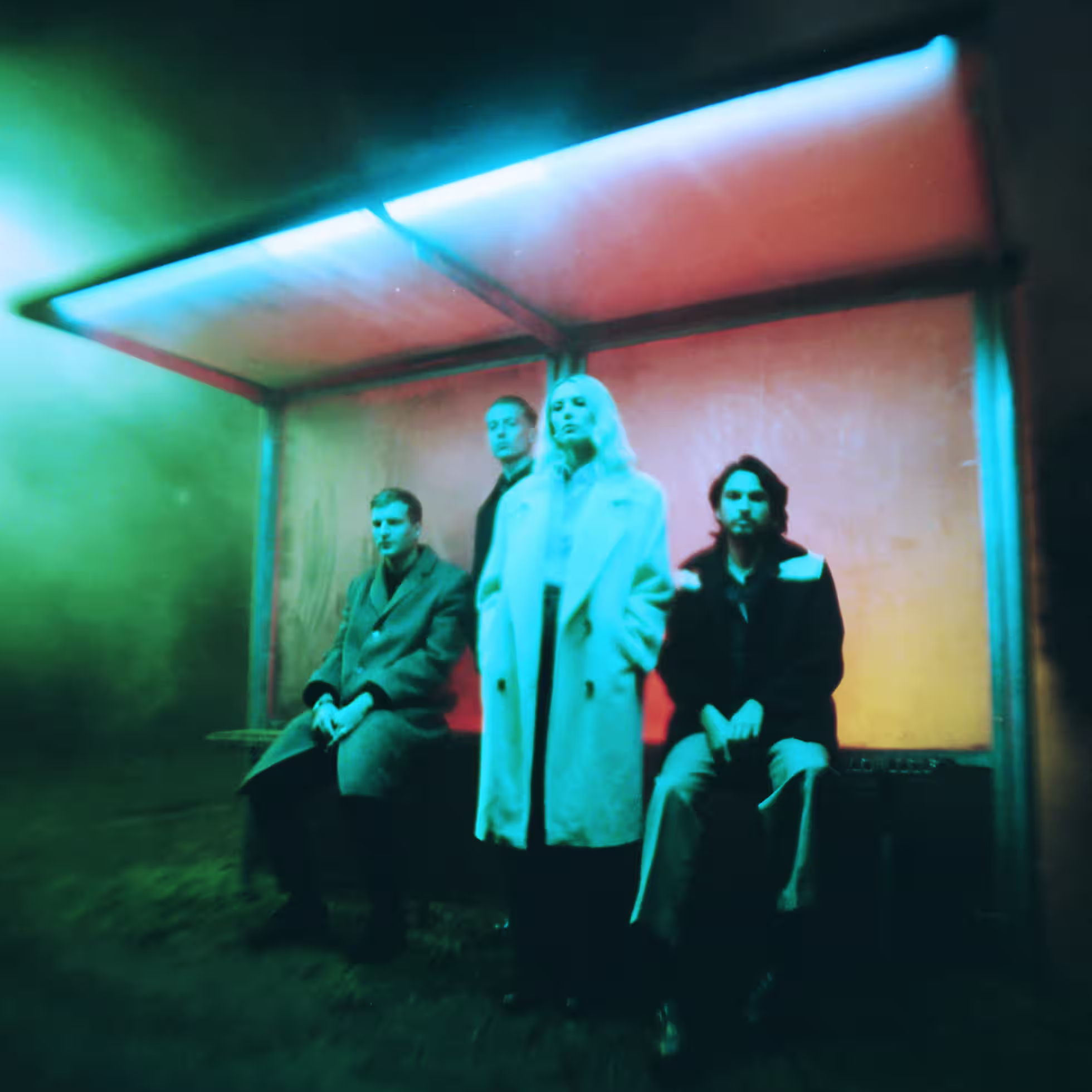
The albums cover, acts as almost like the advert for the project. It's a film poster, an album cover, the character profile. An ambient, dark, moving and yet beautiful image for a brilliant album.
15. Blur- Parklife
Another Britpop stalwart. 'Parklife' is Blur's third album, the band at their Britpop best. Albarn's song writing on this record is some of his best. A collection of stories all with their own characters. It is quintessentially British and the band wanted this to reflect in it's cover.
The albums cover was taken The front cover of greyhound racing was taken on 2 November 1988 at Romford Stadium, Essex, by sports photographer Bob Thomas. “He couldn’t believe we wanted it for a record cover,” recalled designer Rob O’Connor.
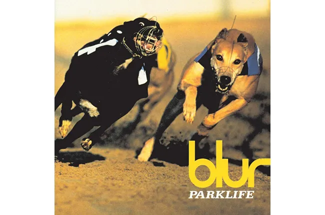
O' Connor also commented on some of the alternative cover ideas, and titles. “By the time we did ‘Parklife’ we were really into appropriating popular imagery,”. The designers had previously used a variety of stock photographs and found images for the band's previous two albums, but ideas for the 'Parklife' artwork took them on a ramble around London. Nearly making the cover was a fruit and veg stall in Portobello Road, and for a period of time when the album had the working title of 'Soft Porn', a photo of Buckingham Palace was mooted as the planned image. Can't imagine the LP having as much of an impact if it was called 'Soft Porn'. The little things that change history, eh?
'Parklife' is widely regarded as one of the definitive moments of Britpop. After really finding their feet on 1993's 'Modern Life is Rubbish' the band set their sites on becoming the biggest band in Britain. With character stories about the Britain that the band were living in, all with a hint of wit and sarcasm. The record did what was expected, the band became Britain's biggest band and provided Albarn, Coxon, James and Rowntree an arsenal of brilliant songs.
16. Stereophonics- Performance & Cocktails
The second album by Stereophonics is one of the bands most memorable works. Featuring some of the bands biggest hits 'The Bartender and the Thief', 'Hurry Up And Wait', 'Just Looking' and 'Pick A Part That's New'.
As well as being the album that features some of the bands most well loved songs, it's artwork is just as memorable.
The cover photograph was taken by Scarlet Page in autumn 1998 at a football pitch under the Westway in London, and was inspired by an earlier Annie Leibovitz photograph of a couple kissing outside a prison. The British journalist Tony Barrell did extensive research in 2007 to find the female model in the foreground. In the Sunday Times on 11 November 2007, he identified the model as 27-year-old Lucy Joplin. In an interview with Barrell, Joplin explained that the "faraway look" in her eyes was the result of an evening consuming absinthe and opium, and that she was paid £75 in cash for the shoot
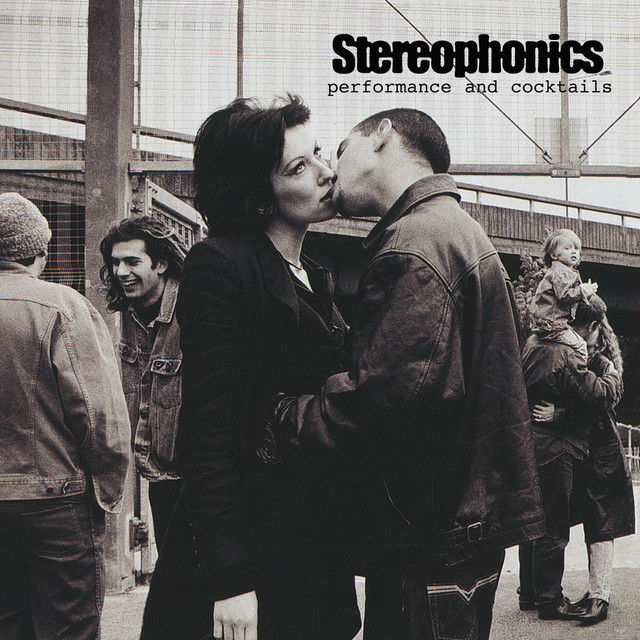
Joplin has since commented on the cover stating that "I don't like the album, but I do love the cover."
Despite being the cover star on one of the bands most famous records, her first and only meeting with the band did not go down very well. She said "I was invited to a special Stereophonics event at the BBC, and I went along with my boyfriend. We went in and there was this 30ft backdrop with the picture of me and the guy kissing. We went to the party afterwards, and everyone was wearing a pass round their neck with a picture of me on it. One of the band members came over and said, 'What do you do?' I said, 'I'm a singer-songwriter' – which I am – and he walked off and they blanked me all night."
The image has now become ingrained in the Stereophonics story. For many it is one of their best records, and it is certainly the bands most iconic artwork.
17. Arctic Monkeys- Whatever People Say I Am
The debut album by the Arctic Monkeys was the most anticipated debut record for a long time. It was the album that propelled the Arctic Monkeys from Sheffield indie kids, to fully fledged rock stars. With two number one singles, including the bands debut single 'I Bet You Look Good on the Dancefloor'
It's cover art sums up some of the lyrical content of the famous record. A photograph taken on a night out.
The man in the photograph is Chris McClure, who is the brother of Jon McClure, of Reverend And The Makers fame.
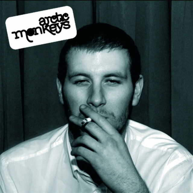
The shot was taken late one night at the Korova Bar in Liverpool by photographer Alexandra Wolkowicz. McClure, who also fronted the Sheffield band The Violet May, told the Guardian about the shoot in 2016: “They said: ‘Go out and get drunk – come back after midnight.’ They gave us a wad of cash, literally hundreds of pounds. We were young and made the most of it.“
This photograph stands as one of the most iconic images of the 2000s. The album it represents is not only one of the most significant British debut records ever but also a universally acclaimed masterpiece. Capturing the essence of British youth culture, it reflects the highs and lows of nights out and the mood of a generation.
The album has it all. Romance, heartbreak, angst, and vivid tales of fame and fortune. The NME described it as: “Essentially this is a stripped-down, punk rock record with every touchstone of Great British Music covered: The Britishness of The Kinks, the melodic nous of The Beatles, the sneer of Sex Pistols, the wit of The Smiths, the groove of The Stone Roses, the anthems of Oasis, the clatter of The Libertines…” It’s hard to disagree with such a perfect summation
It's a timeless record with a cover that is an important and cultural piece in the British indie landscape.
18. David Bowie- The Rise and Fall of Ziggy Stardust and the Spiders from Mars
A lot of people would have chosen 'Aladdin Sane' as when you think of Bowie, many picture him with his red hair, and lightning bolt down his face. Whilst that is a famous image. I always associate Bowie's 70s era in particular with Ziggy Stardust.
It stands as one of Bowie’s most profound moments and the persona he is best known for. Ziggy Stardust, a sexually curious alien rock superstar, is a character who has come down to Earth. While Bowie didn’t initially intend for 'The Rise and Fall of Ziggy Stardust' and the Spiders from Mars to be a concept album, it evolved into a rock opera and the story of this enigmatic spaceman.
The album doesn’t just tell Ziggy’s tale; it also delves into the pressing issues of its time and the personal struggles Bowie himself was facing. From politics and drugs to sex, business, and fame, it offers a panoramic view of the era in which it was created. As all great art reflects its time, this album does so with a perspective that feels less like a mirror and more like a telescope.
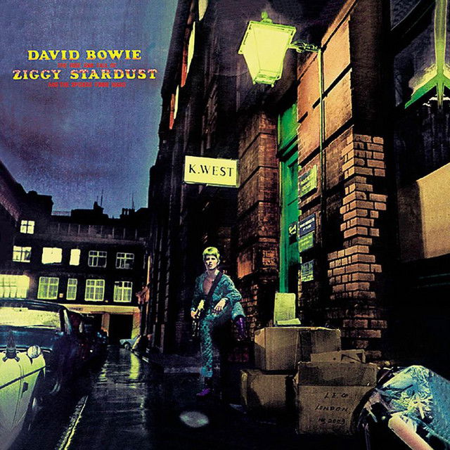
The album cover was shot photgrapher Brian Ward. It does not feature a close up striking image of Bowie as Ziggy, instead it is more subtle. He stands as a diminutive figure dwarfed by the shabby urban landscape, picked out in the light of a street lamp, framed by cardboard boxes and parked cars" Bowie is also holding a Gibson Les Paul guitar, which was used on the album most famously on the song 'Moonage Daydream'
The photograph was taken during a photoshoot on 13 January 1972 at Ward's Heddon Street studio in London, just off Regent Street. Suggesting they take photos outside before natural light was lost, the Spiders chose to stay inside while Bowie, who was ill with flu went outside just as it started to rain. Not willing to go very far, he stood outside the home of furriers "K. West" at 23 Heddon Street.
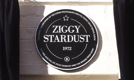
Soon after Ziggy Stardust became a massive success, the directors of K. West were displeased with their company's name appearing on a pop album. However tensions eased and the company soon became accustomed to tourists photographing themselves on the doorstep. In March 2012, The Crown Estate, which owns Regent Street and Heddon Street, installed a commemorative brown plaque at No. 23 in the same place as the "K. West" sign on the cover photo. The plaque was the first to be installed by The Crown Estate and is one of few plaques in the country devoted to fictional characters.
19. The Smiths- Meat is Murder
The Smiths, in particular Johnny Marr and Morrissey are famous vegetarians. The bands second album released in 1985 has the title 'Meat is Murder' and the records title track made the frontman's feelings about vegetarianism, veganism, and animal welfare known. In one of the most outspoken, pleas ever made by the band.
For the artwork, The Smiths used a somewhat famous 1967 photograph of a 20-year-old American Marine called Cpl. Michael Wynn taken while he was fighting in the Vietnam War. The photo appeared in the Oscar nominated 1968 documentary In The Year Of The Pig. Originally, the writing on the helmet read, "Make Love Not War" but the wording on the helmet was changed to "Meat Is Murder" for the sleeve. The original photograph of Cpl. Michael Wynn from Columbus, Ohio was taken in Da Nang, South Vietnam on 21st September 1967 during Operation Ballistic Charge.
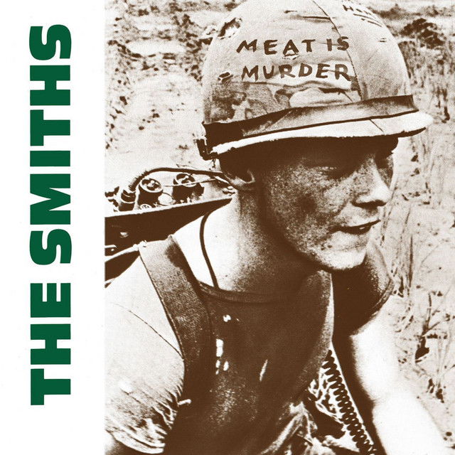
In reply to a question about the Smiths’ album cover, Sergeant Wynn said that he was never asked for his permission about the use of the photo: “I first learned of it when my sister happened to see the album while she was shopping. I wasn’t real happy about The Smiths changing the wording.”
The photo of Wynn has been used in reissues of the album, and even in clothing pieces by New York design house Supreme. Despite the photo being edited by The Smiths for the album, this is often the first time people see the image.
20. Pulp- Different Class
The definitive Britpop album, that saw Pulp become household names. Featuring the bands two biggest hits 'Common People' and 'Disco 2000' and ultimately led to Pulp headlining Glastonbury in 1995. It's album cover is rather unique.
The sleeve design was created by Blue Source. Initial copies of the CD and vinyl album came with six double-sided inserts of alternative cover art, depicting cardboard cutouts of the band photographed in various situations. A sticker invited the listener to "Choose your own front cover". In all standard copies thereafter these 12 individual covers made up the CD booklet, with the wedding photograph used as the actual cover.
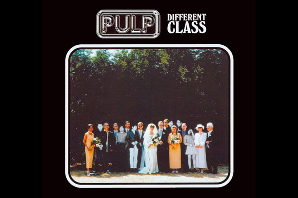
In an interview with BBC Radio 6 Music presenter Chris Hawkins on 8 April 2014, Dom O'Connor, the groom featured in the wedding photograph cover art, recalled how the album cover had come about:
"When we got married we were putting the wedding together ourselves, we pulled a lot of favours from people we knew ... My little brother Ben went to art college in Edinburgh and he made friends with a guy who subsequently became a photographer and had done a lot of work with the Britpop bands – I think he worked with Blur, and Elastica, and of course Pulp. So we asked him about a couple of months before whether he would be prepared to do some photos for us, and he couldn't actually do it because he said he was busy working on some Pulp stuff. But he phoned us about a week before and said Pulp were thinking about using some photos with real people in them, including a wedding photo, and if we would do some joke shots where he'd bring some life-size cutouts of the band down, he would do some proper wedding shots for us as well. And that's basically what happened. They rocked up on the wedding day with the life-size cutouts of the band and took the photos, and I suppose the rest is history."
The photograph features the actual wedding party as well as cardboard cutouts of the band. The bride and groom were unaware that the photographs would be used for the album, until the grooms mother saw a poster in HMV. Pulp's record company at the time did not pay the family for the use of their picture, but when Pulp reformed in 2011 Rough Trade paid for the family members to see Pulp play live. O'Connor said, "Rough Trade very kindly sent us a signed copy of the photo that Jarvis had signed last year, just saying 'Thank you very much Dom and Sharon for letting us crash your wedding', which I thought was a really nice touch actually"
It's quite the story, at least the couple were thanked for being the cover stars of one of the most famous British albums of all time.
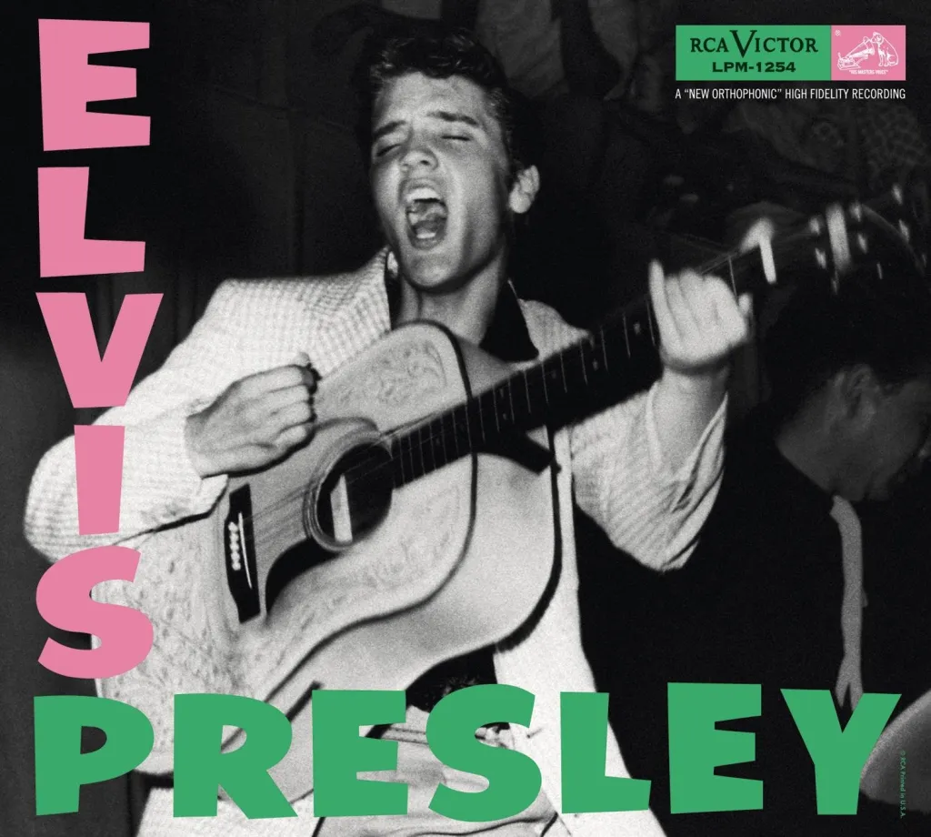
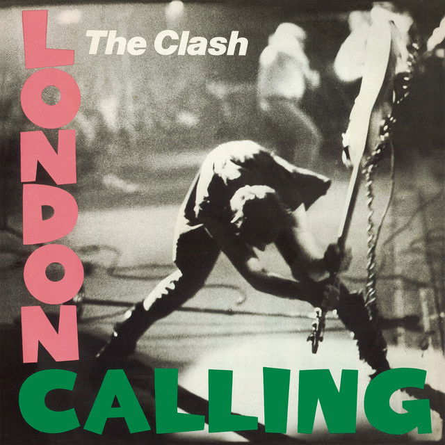
21. The Clash- London Calling
The Clash 'London Calling' is one of the most famous album covers ever. It also pays homage to another really famous album cover. The green and pink lettering used on the cover is almost exactly the same as Elvis Presley's self titled debut album.
The Clash were not intent with matching the album though. Where the Elvis record saw the King simply playing the guitar. 'London Calling' features Clash bassist Paul Simonon in the act of destroying his Fender Precision Bass guitar at a concert in New York City. It was September 20, 1979, at the Palladium to be exact. And interestingly enough, Simonon’s swing wasn’t staged. Photographer Pennie Smith caught the musician in a genuine moment of frustration.
Pennie Smith, who photographed the band for the album, originally did not want the photograph to be used. She thought that it was too out of focus, but Strummer and graphic designer Ray Lowry thought it would make a good album cover. In 2002, Smith's photograph was named the best rock and roll photograph of all time by Q magazine, commenting that "it captures the ultimate rock'n'roll moment – total loss of control"
The album is more than just its iconic cover art—it’s a cultural landmark and a testament to The Clash's artistic evolution. It features some of the band’s best work, blending punk rock with a rich array of genres, including reggae, ska, rockabilly, and soul. Tracks like "London Calling," "Train in Vain," and "The Guns of Brixton" showcase their ability to push boundaries while staying true to their rebellious spirit.
Lyrically, the album captures the political and social unrest of the time, addressing themes of unemployment, racial tension, and disillusionment with authority. Its urgency and raw emotion resonated deeply with a generation, and its influence continues to be felt in music and culture. London Calling isn’t just an album it’s a statement of defiance and a celebration of the power of music to inspire change.
22. The Strokes- Is This It
'Is This It' changed the guitar music landscape in the early 2000s. The Strokes came out at the perfect time, guitar music was at its lowest point in a long time. Britpop had burst and Nu Metal ruled the airwaves. This album reinvented guitar music for the better and spawned some of the most influential bands of the 2000s.

The albums cover art is by Colin Lane and features a photograph of a woman's rear and hip, with a leather-gloved hand suggestively resting on it. The model was Lane's then-girlfriend, who explained that the photoshoot was spontaneous and happened after she came out of the shower naked. The artwork caused some controversy, the image was used for the international market, although British retail chains HMV and Woolworths objected to the photograph, they stocked the album without amendment.
For the American market and the October 2001 release, the cover art of Is This It was changed to a psychedelic photograph of subatomic particle tracks in a bubble chamber. RCA product manager Dave Gottlieb commented that "it was straight up a band decision", while Gentles indicated that Casablancas had wanted it to appear globally. According to the band's manager, the frontman phoned him before the Japan and Europe release and said, "I found something even cooler than the ass picture." At the time, the Lane photograph was already at the presses and was included in the July and August 2001 versions.
The album nearly didn't get the famous artwork. It is one of the most iconic photographs of the 2000s, and it is hard to imagine the album without it.
23. Bloc Party- Silent Alarm
'Silent Alarm' is one of the most overlooked releases of the 2000s, yet it is one of the most influential and genre-defying records of the era. Drawing from a wide range of influences, the album fused elements of post-punk, indie rock, and pop/dance music, creating a sound that was both urgent and intricate. It marked a departure from the often formulaic indie rock of the time, offering something far more experimental and forward-thinking.
The albums cover art is a stark crispy-clean sheet of white snow, with a tiny far-off line of spindly dead-grey trees. From a distance, it almost looks like a tangled length of barbed wire, spiky and hard to hold down. Taken by Ness Sherry the image perfectly captures Bloc Party at that time, a band who did not conform to the indie norms. Instead creating atmospheric music, similar to the landscape portrayed within the photo.

The album was a sensation upon its release, selling in droves and achieving Gold status in the UK within just 24 hours. Tracks like 'Helicopter' and “Banquet' became instant anthems, their driving rhythms and frenetic energy resonating with fans around the world. 'Helicopter,' in particular, with its sharp, angular guitars and biting lyrics, emerged as a rallying cry for a generation yearning for something more dynamic than the formulaic offerings of mainstream rock at the time.
'Silent Alarm' wasn’t merely a snapshot of the mid-2000s indie rock scene. It pushed the genre forward and helped define the sound of an era. Balancing introspection with ambition, the album crafted songs that felt deeply personal yet universally relatable. Its iconic cover art played a significant role in its appeal, capturing attention both upon release and in the years since, as the album continues to hold its place as a modern classic.
24. The Black Keys- Brothers
'El Camino' is the one with all of the hits on. However, I think the artwork on 'Brothers' is genius. The band decided to be really on the nose with their approach. No avant garde images, no hidden meanings. They get straight to the point.
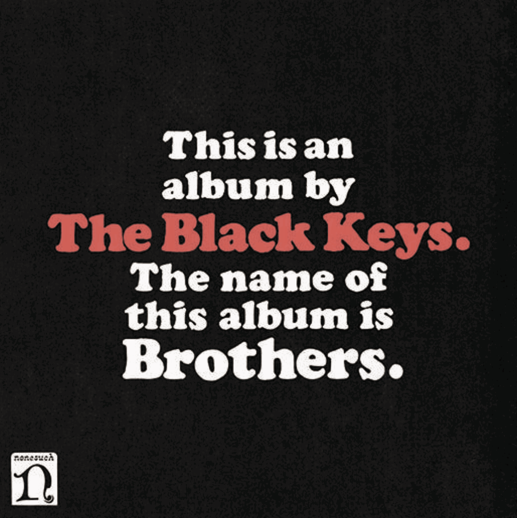
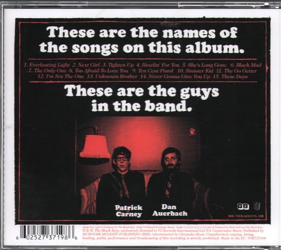
The artwork for ‘Brothers’ was designed by Michael Carney, the brother of the band’s drummer, Patrick Carney. Its simplicity was intentional, as the band wanted to move away from the more illustrative style used on their previous records.
The cover cleverly conveyed the band’s message through straightforward text, with the front boldly stating, "This is an album by The Black Keys. The name of this album is Brothers."
Michael explained that taking risks with unconventional packaging added an incentive for fans to purchase physical copies. He also noted that the minimalistic design worked well for digital platforms, as it "jumps out on the iTunes page."
This clever approach to album design was not only unique but also humorous, reflecting the band’s personality. The release of ‘Brothers’ felt like a complete package—and it worked. The album won three Grammy Awards, including Best Alternative Music Album, Best Recording Package, and Best Rock Performance by a Duo or Group with Vocal.
Commercially, the record was a massive success, achieving platinum certification in the US, double platinum in Canada, and gold in the UK.
25. Fontaines DC- Dogrel
Fontaines D.C.’s debut album, ‘Dogrel’, introduced listeners to a raw, narrative-driven style of storytelling, offering a snarling critique of youth disillusionment with the establishment and modern life. The album’s title is derived from a form of Irish working-class poetry, reflecting its deep connection to the band’s heritage and perspective.
Filled with poetic moments, ‘Dogrel’ paints vivid portraits of the band’s surroundings and the people who inhabit them. Tracks like “Big” open the album with a defiant statement of intent, while “Boys in the Better Land” celebrates and critiques Irish identity with a swaggering, chant-like intensity. The haunting “Television Screens” explores themes of disconnection and modern isolation, showcasing the band’s ability to pair poignant lyrics with atmospheric instrumentation. Meanwhile, “Liberty Belle” and “Roy’s Tune” offer reflective, bittersweet glimpses of urban life and working-class struggles
The album is a stunning collection of brilliant, emotionally resonant songs, performed by a band of exceptional musicians and fronted by one of the finest lyricists of his generation.
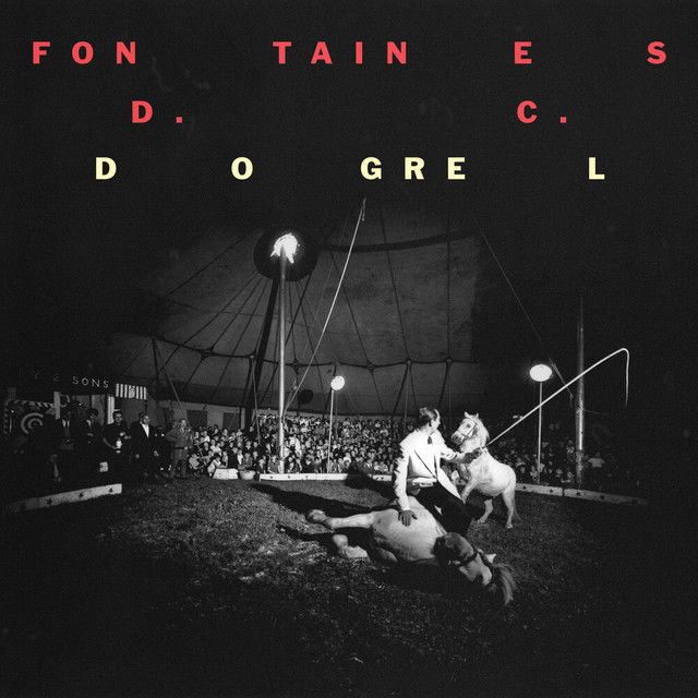
The album artwork is an old photograph by a photographer called Bruce Davidson. It was shot in 1967 at the Duffy & Sons circus, a circus that still travels Ireland today. Fontaines DC wanted the albums artwork to be Irish. Whether it be a photograph of the band themselves or a photograph taken in Ireland.
This was the photo that was chosen. It represents a performance but a failed performance that shows vulnerability, a theme that is explored throughout this album.
An exceptional debut record, with an iconic piece of Irish history as it's cover.
26. The Jam- Sound Affects
This album is often regarded as The Jam’s most ambitious record, showcasing their evolution from punk and mod revival roots into more experimental and sophisticated territory. Widely celebrated as one of their most accomplished works, it blends sharp social commentary with bold musical innovation. Drawing inspiration from a diverse range of influences, including The Beatles’ Revolver and Michael Jackson’s Off the Wall, the album demonstrates the band’s creative growth and versatility.
The record features standout singles that highlight its breadth and depth. “Start!” is a chart-topping track with a bassline directly reminiscent of The Beatles’ “Taxman,” blending familiarity with the band’s distinctive edge. “That’s Entertainment” offers a poignant reflection on the mundanity and unexpected beauty of working-class life in England, famously written in a single night. “Pretty Green” delivers a biting critique of greed and capitalism, its sharp lyrics matched by a propulsive rhythm.
This album solidified The Jam’s status as one of the most influential bands of their era, proving their ability to innovate while maintaining their connection to the social pulse of the time.
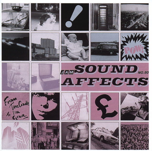
The album's artwork was designed by Bill Smith, and draws inspiration from the work of Peter Blake, the British pop artist who famously designed 'Sgt. Pepper's Lonely Hearts Club Band' for The Beatles. Each of the images on the album cover is meant to relate to songs on the album. Smith shared the photography for 'Sound Affects' with Martyn Goddard, and they took photos of numerous items relating to daily life.
The album perfectly encapsulates what The Jam are all about, and it's cover captures who The Jam's music is about. Paul Weller was writing anthems for the every man. It is one the best albums of the 1980s with one of the most iconic pieces of cover art.
27. Primal Scream- Screamadelica
Released in September 1991, 'Screamadelica' is widely hailed as a landmark album that defined a generation. It bridged the gap between indie rock and the burgeoning rave culture of the late '80s and early '90s, encapsulating the euphoric, hedonistic spirit of the era. Produced by Andrew Weatherall, the album broke new ground by seamlessly fusing acid house beats, gospel influences, psychedelic rock, and dub rhythms into a cohesive, genre-defying masterpiece.
The album features several iconic tracks that highlight its revolutionary sound and enduring appeal. “Movin’ On Up” serves as a gospel-tinged anthem of hope and liberation, blending uplifting lyrics with joyous instrumentation. “Loaded,” a transformative remix of their earlier track “I’m Losing More Than I’ll Ever Have,” became a house music classic, layering groove-driven rhythms with an infectious dancefloor energy. Meanwhile, “Come Together” stands as a sprawling, euphoric celebration of unity, perfectly capturing the communal spirit of rave culture.
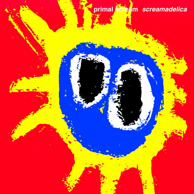
The albums cover art was designed by Paul Cannell, and is one the most recognisable album covers of the 1990s. Inspired by the vibrant and surreal energy of the album, created the artwork as part of his association with Creation Records.
The artwork is a psychedelic sunburst with bold primary colors (red, yellow, and blue) arranged in an abstract, almost childlike design.The design resembles an explosion of light or energy, evoking feelings of joy, chaos, and euphoria, perfectly mirroring the album's sound. The irregular, hand-drawn style gives it a raw and organic feel, aligning with the DIY ethos of the rave and indie cultures of the time.
The late 1980s and early 1990s in the UK were defined by the rise of acid house and rave culture, with youth embracing all-night parties, electronic music, and a sense of communal ecstasy. 'Screamadelica' became the soundtrack to this cultural movement, breaking barriers between rock and dance music.
The album also arrived at a time of social change, with the optimism of rave culture providing an escape from the economic and political struggles of Thatcher-era Britain. The artwork’s vibrant and celebratory tone resonated with the sense of possibility that the rave scene embodied.
28. The Beatles- Sgt Pepper's Lonely Heart Club Band
This is arguably the most famous album cover of all time, and most definitely one of the most iconic. Created by Jann Haworth and Peter Blake, the aim of the image was show the new band, 'Sgt Pepper's Lonely Heart Club Band' surrounded by fans after a performance.
Blake said "I suggested that they had just played a concert in the park. They were posing for a photograph and the crowd behind them was a crowd of fans who had been at the concert. Having decided on this, then, by making cut-outs, the fans could be anybody, dead or alive, real or fictitious. If we wanted Hansel and Gretel, I could paint them and they could be photographed and blown up. I asked the four Beatles for a list and I did one myself. The way that worked out was fascinating. John gave me a list and so did Paul. George suggested only Indian gurus, about six of them, and Ringo said, "Whatever the others say is fine by me" and didn't suggest anyone. It's an insight into their characters. All kinds of people were suggested. Hitler was there; he is actually in the set-up, but he is covered by the Beatles themselves as we felt he was too controversial. The same applied to Jesus.
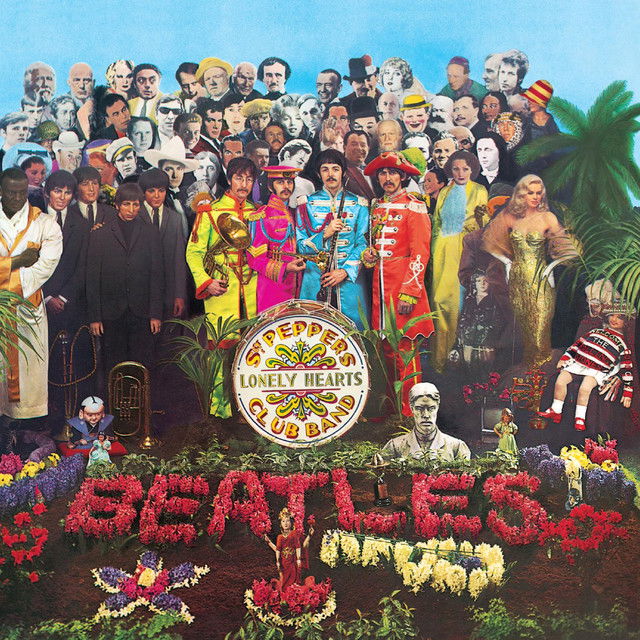
A total of 58 people are depicted on the cover, alongside a host of objects. The famous photograph was taken by Michael Cooper. The final cost for the cover art was nearly £3,000 (equivalent to £69,000 in 2023), an extravagant sum for a time when album covers would typically cost around £50 (equivalent to £1,100 in 2023).
The album's cover adds to the mystique of Sgt. Pepper's Lonely Hearts Club Band, with its vibrant, eclectic photo becoming just as iconic as the music itself. The cover, featuring the band surrounded by a cast of famous figures and bright, surreal colours, perfectly captures the experimental spirit of the era and the groundbreaking nature of the record. For many, Sgt. Pepper ranks as one of the Beatles’ finest achievements, a landmark in both popular music and cultural history.
The songs on the album further cement its legendary status. “Lucy in the Sky with Diamonds” is perhaps one of the most famous, with its surreal, dreamlike lyrics paired with lush orchestration, a staple of the album’s adventurous approach to both sound and style. “A Day in the Life” encapsulates the ambitious nature of the album, with its orchestral crescendos and shifting moods, combining personal reflection with an epic sense of scale.
What John Lennon, Paul McCartney, George Harrison and Ringo Starr achieved on this record is nothing short of extraordinary. It is one of the most groundbreaking albums ever, and still continues to influence musicians today.
29. Charli XCX- Brat
Another fairly recent album. However, that does not take away from its impact. The album was one of the best and most important albums of 2024. Her Boiler Room Set, I’m so Julia”, the Lorde remix, the ‘Apple’ dance…, Kamala Harris. It transcended music, it created social media trends, led to some craxy remixes, some unexpected covers and even infiltrated the US election.
After years of attempting to be a pop star, Charli turned her back on the pop sound, instead embracing clubs, the dancefloor and pushing her own limits. Unexpectedly it made her arguably the biggest pop star in the world. These songs are pop masterpieces but also see XCX at her most raw and at times vulnerable. Ripping up the rule book on pop music. Charli is going her own way.

The album's minimalist cover became one of the most iconic images of the year. Charli decided on the cover for a different reason though. Money. She wanted to save money. Speaking to Apple Music's Zane Lowe, she decided to use a text based cover because she did not think the album would be a success.
She said: “Where the actual first idea of doing a text cover came from was to save money. I was like, ‘This album is not going to appeal to a lot of people.’”
To that end, it seemed logical to put the money elsewhere. She continued: “I was like, ‘I think I will do a press shoot and then maybe we just save on the album cover.’”
The album's artwork added to the idea of 'Brat' it went against the pop culture brand, and instead triggered questions and criticism from certain people. In an interview with Vogue Singapore. Charl said “I wanted to go with an offensive, off-trend shade of green to trigger the idea of something being wrong. I’d like for us to question our expectations of pop culture –why are some things considered good and acceptable, and some things deemed bad? I’m interested in the narratives behind that and I want to provoke people. I’m not doing things to be nice.”
Fans ran with the cover, and it grew into an internet trend. Cementing itself as one of the most iconic album covers of recent memory.
30. The Libertines- The Libertines
Another of the noughties most iconic albums by one of the decades brilliant but also fractured groups. A band built on the relationship between Pete Doherty and Carl Barat. Who by the time this album was released had been through a lot. In the two years since the bands debut album 'Up the Bracket' The Libertines had been through a split a burglary, prison to reconciliation, facial injuries to estrangement.
Doherty had been released from prison after being sentenced for breaking into Barât’s flat and stealing his computer and a few other valuables. The friendship had become estranged, and yet somehow they managed to bury the hatchet and released this record.
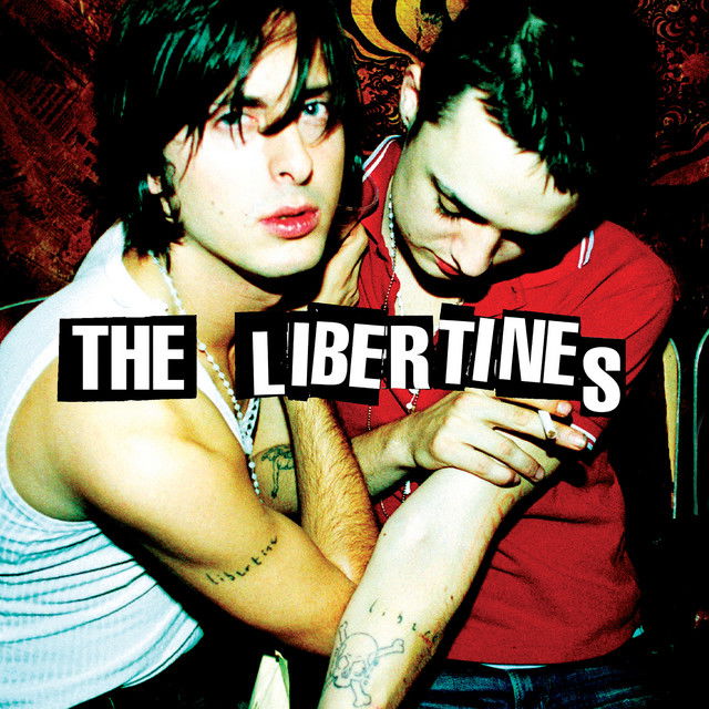
The photo captures Barât embracing his bandmate as if offering absolution. Barât gazes toward the camera with a sense of strength, almost as if he is protecting the frail and vulnerable Doherty. Doherty, on the other hand, appears either lost in the emotion of the moment or drifting in a chemically induced stupor. Together, they display matching tattoos of the band’s name in Barât’s handwriting, a symbol of their deep bond and enduring allegiance to both the band and each other, despite the challenges they've faced.
Over time, both have come to truly understand one another, and their relationship is marked by a genuine friendship. The photograph, taken by Roger Sargent during the emotional "Freedom Gig" at the Tap 'n' Tin club in Chatham, Kent, on October 8, 2003, captures a pivotal moment when Doherty reunited with The Libertines for a performance just hours after being released from jail. This poignant image reflects the fragility of both Barât and Doherty, encapsulating the raw emotion of the reunion and the complex bond they share.
The End...
There are so many more albums I could have included in this list—like the minimalist black image of Franz Ferdinand’s debut, Peace’s debut album 'In Love', the dystopian world of 'OK Computer', and the striking black balaclava on Kneecap’s 'Fine Art.
Album covers are an integral part of the story and history of a record, serving as a personal connection to the music. When we first encounter an album, it’s often the cover that draws us in. Much like a film trailer or a book blurb, it’s our first impression.
Some album covers go on to create their own narratives and legacies, becoming as iconic, if not more so, than the albums themselves. Others become deeply intertwined with the music, enriching the experience as a whole.
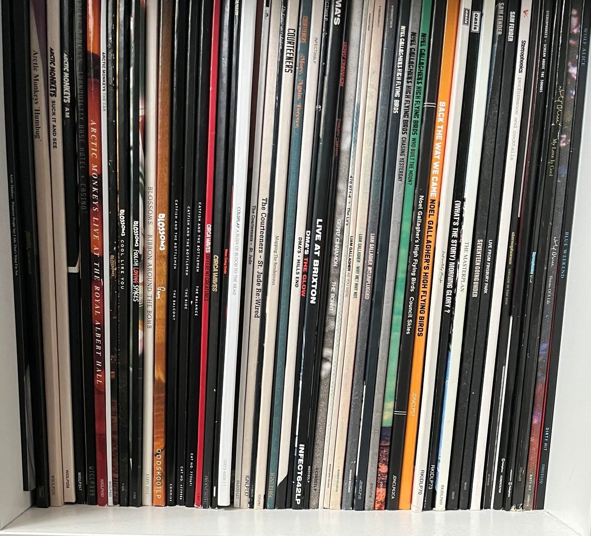
As Noel Gallagher said in the 2022 documentary Squaring the Circle (The Story of Hipgnosis), “Vinyl is like the poor man’s art collection.” These covers are indeed works of art, each contributing to the overall moment. Reading the lyrics, studying the artwork, diving into the song credits. Who played on this album and what instruments did they play? I do it with my record collection, whether I’m buying something new or revisiting something I already own. It’s all part of that experience.
Now, I couldn’t tell you the last time I stepped foot in an art gallery honestly, I don’t think I’ve ever gone by choice. But I can tell you exactly when I last visited a record store and when I last played a record. For me, vinyl offers a direct connection to art, music, my memories and emotions on a much more personal level.
In the end, album covers do more than just protect the music, they tell a story, evoke a feeling, and, in some cases, transcend the album itself, becoming an art form that lives in our hearts and minds.
Thank you ever so much for reading
Jack